

History & Climate page
Within this new page, there is now a broad scope of functionalities focused on historical weather data and climate data. Below you can find an overview of these features.
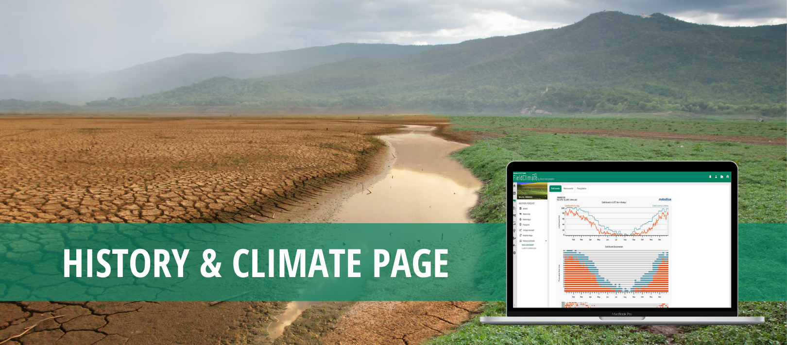
1. Risk assessment
The risk assessment diagram displays the probability of a specific weather event or risk to occur during a year. The diagrams are available for
1) cold,
2) warm events and
3) precipitation,
and are based on more than 30 years of historical simulation data. By comparing different years, you can reveal patterns of specific events. This diagram assists in weather dependent decisions such as outdoor activities, or sowing periods.
The risk assessment diagram is subdivided into 3 parts:
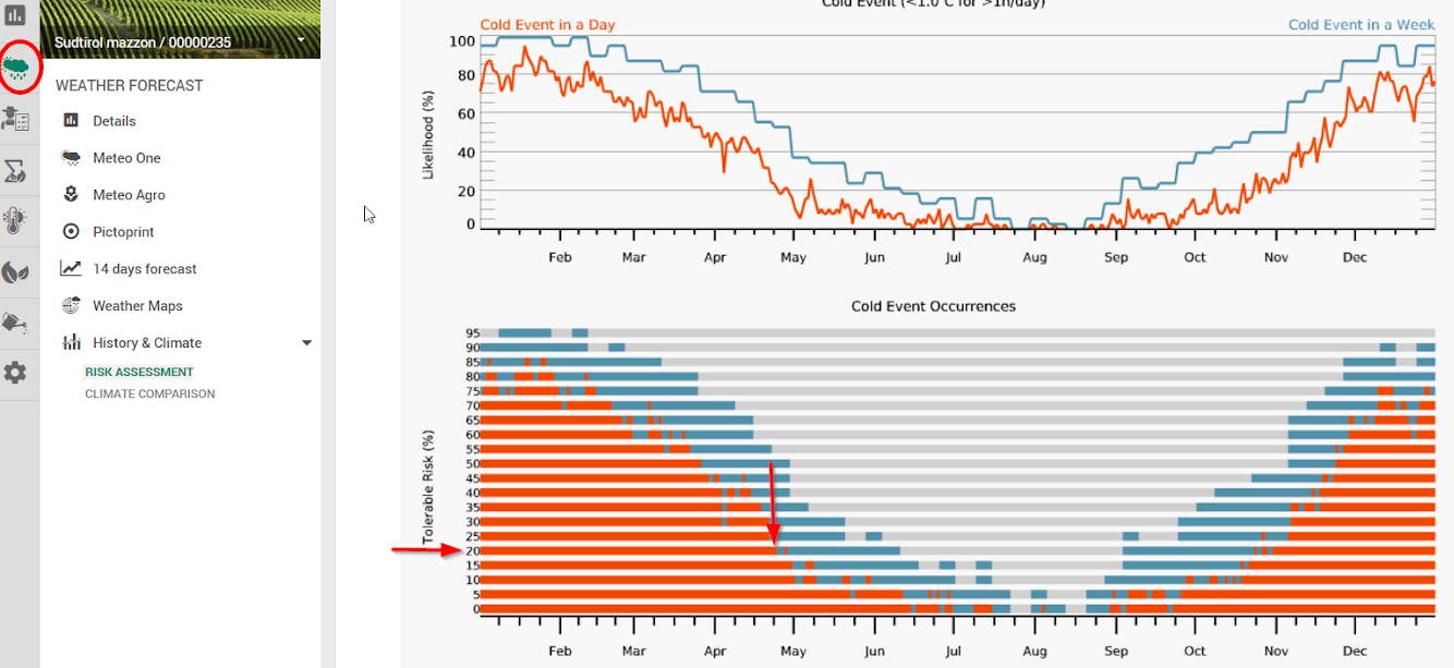
- Likelihood: The first diagram shows the likelihood of a certain event in percent (%). The y-axis indicates the likelihood, whilst the x-axis displays the time frame for all diagrams.
- Tolerable risk: The tolerable risk approximates the personal tolerable risk in percent (%). This enables the risk evaluation by taking into account divergences, which are personally acceptable. The y-axis indicates the tolerable risk in percent.
- Years: The third diagram compares the event occurrences of the last 40 years. The y-axis shows the different years. This helps to differentiate seasons and assists in evaluating the probability of a certain event.
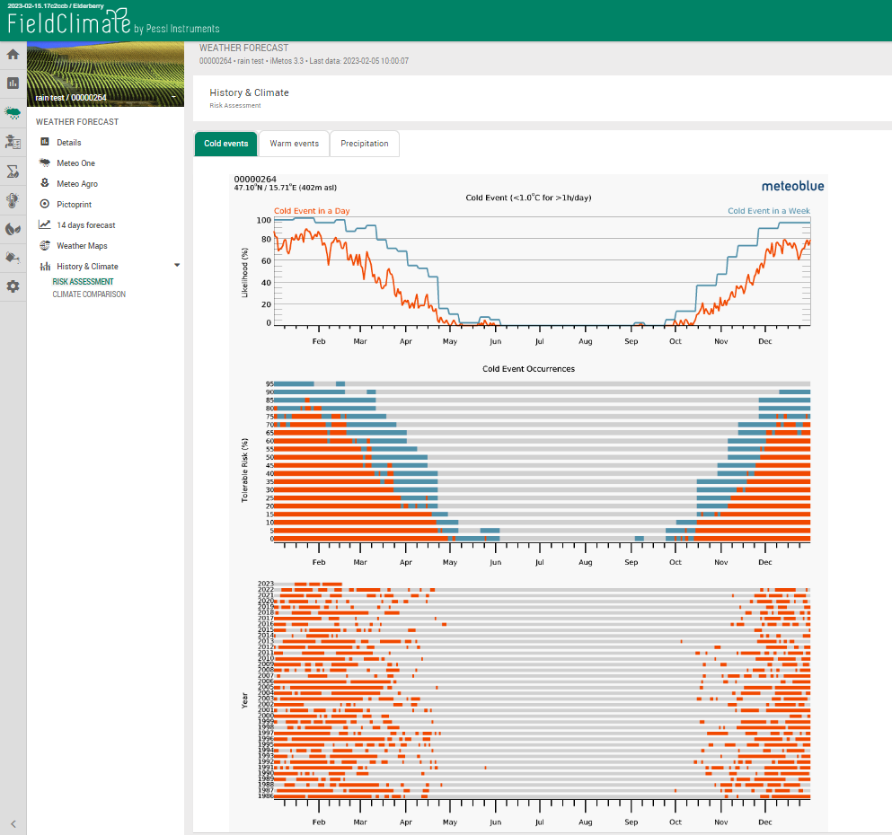
1.1 and 1.2 Cold and warm events
Temperature is below or above a certain threshold for a certain time. The threshold is set for temperature values at 1°C for cold events while at 30°C for warm events. The cold events meteogram is commonly used to evaluate frost.
The first diagram shows the likelihood of the defined event. You can estimate your personal risk in the second diagram. For instance, if your personal tolerable risk for a frost event is 20% you should schedule sowing later (e.g. end of April). On the other hand, if you can accept 50% frost likelihood in favor of earlier sowing, you should sow earlier (e.g. beginning of march).
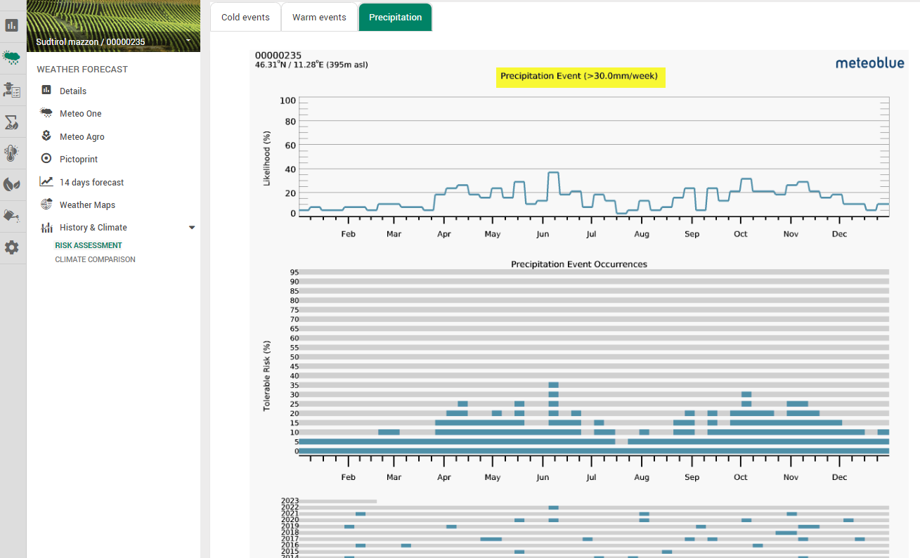
1.3 Precipitation
This variable evaluates precipitation amounts in a week above a certain threshold and with the help of this representation; you can estimate strong precipitation events and schedule activities accordingly. The threshold for precipitation amounts is set at 30 mm/week.
2. Climate comparison
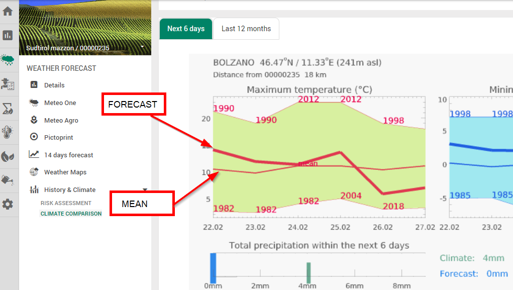
2.1 Next 6 days meteogram
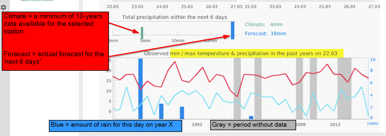
The meteogram Climate comparison shows the expected weather, compared to the weather of the previous 10 or more years. Thereby, you can see how “normal” the current weather is.
The meteogram Climate comparison looks for the closest place which has a weather station with minimum 10 years of reliable measurements available. The name of the place with the station is indicated in the meteogram title, as well as the distance from the selected place.
The temperature chart shows the range of maximum, mean (thin line) and minimum temperatures of the past years, and the forecast of the next 6 days (thick line). The total precipitation for the next few days is shown in the precipitation chart, relative to the average precipitation of the period during the last years.
The climate chart shows temperature and precipitation of the current date as measured at the station on the same date during the past years. Years without measurement are marked with a gray bar.
For the climate chart, the nearest weather station, for which reliable measurements over 30 years are available, is selected automatically. In hilly areas, this station can be located at a different altitude than the selected place. Therefore the climatic diagram shows the measurement and the forecast for this station, and not for the selected place.
2.2 Last 12 months meteogram – Current to climate
The “Last 12 months” meteogram enables a comparison of weather variables of the current season to the 30 year mean climate.
This diagram shows the current season compared to the average climate for a chosen place. The diagram is labeled with temperature and months.
- The black line shows the mean temperature for every month of the last 12 months (current).
- The thick orange line shows the calculated mean temperature of the last 30 years for every month (climate). This line denotes the exact mean of the temperatures but does not reveal fluctuations of the temperature from year to year.
- The orange buffer around the red line makes the fluctuations between the last 30 years more visible. It shows in what range the temperatures of the last 30 years are distributed. It shows the maximum monthly mean and the minimum monthly mean of the last 30 years.
Interpretation
- The wider the buffer around the red line, the more fluctuations between the years are common in this month.
- If the black line runs outside of the orange buffer, this means that the temperature of the current month or season does not correspond to the usual average temperature expected in this place.
- If the black line lies within the orange buffer, this means that the current temperatures fit the usual climate.
2.2.1 Monthly precipitation
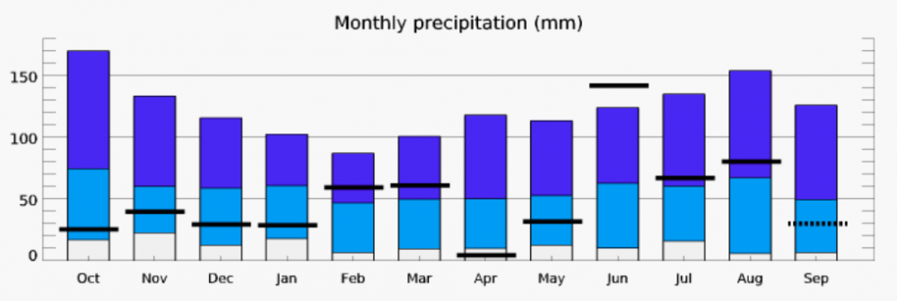
The diagram for the monthly precipitation shows the amount of precipitation for each month of the last 12 months compared to the precipitation of the last 30 years. The graph is labeled with millimeters and months.
- The black-horizontal bars show the recorded precipitation for each current month.
- The dark blue bars show the maximum amount of precipitation during the last 30 years for each month.
- The light blue bars show the minimum amount of precipitation during the last 30 years.
- The white bars show the minimum amount of precipitation during the last 30 years.
Interpretation
- If a black bar is beneath the light blue bar or above the dark blue bar, this means that the current monthly sum of precipitation does not correspond to the 30 year average.
- The longer the blue bars, the greater the fluctuations of monthly precipitation are between the last 30 years.
- The shorter the blue bars, the less fluctuations there were in the last 30 years, which means that the amount of precipitation has been more constant.